

Our previous blog explored why most start-ups struggle to stand out.
Generic, vague, inconsistent, and jargon-filled messaging will cause your brand to lose the trust of its customers. If you blend in and sound like everyone else, your brand will quickly be forgotten.
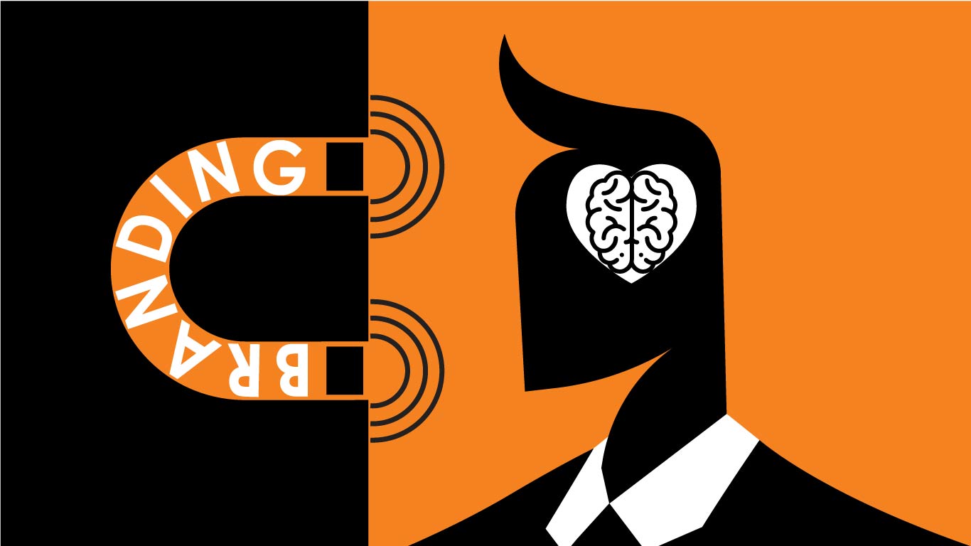
Today, we'll explore why and how some brands quickly draw the public's attention. Colour, typography, and stunning visual language can make all the difference when it comes to building trust and standing out. This isn't design theory. It's hardwired psychology, and ignoring it is costing you customers.
You're Not Competing on Product. You're Competing on Perception.

Brand owners like to believe that the quality of their products speaks for itself. The truth is—it doesn't. People decide whether they trust your start-up in under 50 milliseconds.
And that's even before they understand exactly what you do. Your visual identity is your first pitch.
People don't buy the best product. They buy the brand that makes them feel something immediately. A sense of authority. A sense of alignment. A sense that this is what I've been looking for. Perception is the real battleground. And branding is how you win it.
Colour Triggers Survival Instincts
Colour tells the brain what's safe, what's exciting, and what's powerful. It doesn't just look nice.
For example, a saturated orange can bring up associations for bold, disruptive, fast-moving. Muted blue is often connected with trustworthy, established, and corporate. Red usually means aggressive, demanding attention, and urgent.
The truth is that people feel colour before they read. The association is already made. If your brand palette sends mixed signals, you're bleeding conversions before anyone clicks.
That is more primal than you think. Our brains associate certain hues with survival states—safety, danger, community, and territory. When your brand colour is misaligned with your product's tone or personality, people can't explain why they're hesitant—they just are. And that unconscious rejection? It's fatal.
Typography Isn't Just Style. It's Authority.

Fonts are also loaded with subconscious meaning. Hevy serifs are associated with dominance and legacy, while sleek sans-serifs suggest innovation and flexibility. If your brand promises disruption but types like a law firm, you're lying to your audience. Rulers will spot the inconsistency and walk away. Creators will sense it doesn't align with the experience they expect. Typography sets the tone. It signals whether your message should be taken seriously or skimmed and ignored.
Typography is not just about taste. It is leadership language. You don't build trust with a cutesy display font. You don't build credibility with inconsistent headings. You build it with structure, rhythm, clarity—and an intentional hierarchy that respects your reader's attention span.
Design is a Power Move
Your visual language tells people where your brand belongs. Is it leading? Or maybe next-gen? Is it a safe bet or a loose cannon?
Whether you realise it or not, every visual detail signals rank. Creators want to be part of a fresh, bold, and beautiful movement. Rulers want to align with a brand that exudes certainty, strategy, and discipline. If your start-up looks like it was stitched together in Canva last night, don't be surprised when nobody takes you seriously. That isn't harsh. It's real.
Visual structure isn't decoration—it's a command. Clean lines. Tight grids. Controlled colour. These things radiate intention. And intention is read as power. Power attracts both followers and investors. Sloppy, inconsistent visuals repel them. Your design is how you claim space in the market.
Want Loyalty? Build Visual Consistency.

The human brain trusts what it recognises. That is why visual consistency is so important—it is actually your growth strategy. Every time your brand appears, it must reinforce the same promise, tone, and energy.
When you are consistent, you build memory structures in your audience's mind. When your website, packaging, emails, and ads feel like they came from different universes, you fracture that trust. Fragmented trust is the death of loyalty.
Every visual decision you make must anchor your core brand story. It's not just about fonts and matching colours. It's about strategic alignment. Your brand's purpose must be noticeable in every design element of your brand. When your brand shows up in the world with secure visual confidence, people respond. They follow. They advocate. They buy.
The Uncomfortable Truth About DIY Design
DIY design can be a great starting point, but that's about it. It looks acceptable and feels safe, but if it's easy for you, it's easy for our competitors. If you all look the same, you only compete in price.
AI logo generators and pre-made templates don't build brands. They build noise. They give you just enough to blend in but never enough to lead. And the reality is that leading is the only thing that matters in a competitive market. Your brand needs to be sharper, not louder.
Branding Isn't Design. It's Decision-Making Psychology.
Design is just the visible element of branding. Branding is, in fact, strategic perception control. It's about aligning every visual and verbal cue with how you want your business to be perceived and remembered. That's what great brands do. They choreograph trust. They use every psychological trigger—from font weight to whitespace—to influence a buying decision before logic even gets involved. That's not manipulation. That's leadership.
Let's go further. Branding is memory engineering. It's how you script association. It's how you make someone feel like they've seen you before, even if they haven't. The right visual hierarchy, the right brand voice, the right motion cues—they all anchor you in the minds of your audience. That's what creates longevity. That's what creates market power.
So Why Are You Still Guessing?
You can't afford to wing this. Not in a market moving at this speed. Not when your audience is this distracted. Not when their first impression is likely their last. Your brand is either built to influence the brain or built to be ignored. There is no middle ground. No safe option. No neutrality in design. Either you lead, or you follow.
Let this be your pivot point. Stop treating branding as a surface-level exercise. Start treating it as your most potent growth engine. You can optimise every other part of your funnel—but if your brand fails to compel at first glance, none of it matters. You'll never make it to the pitch. Never make it to the call. Never make it to checkout.
You're Building Something Big. Make Sure it Looks the Part.
If you're serious about positioning your brand to dominate your category, it starts with aligning your design with how trust is actually formed. At Metaka Branding Studio, we don't make pretty things. We engineer attention, credibility, and market power through strategic visual identity.
Your competitors are building funnels. You're building a legacy. Let us help you make sure it looks like one.
Let's build a brand that people remember—and follow.


